Product design + Branding
A marketplace and delivery platform that connects neighborhood supermarkets with consumers, digitizing a market segment that operated outside the digital ecosystem.
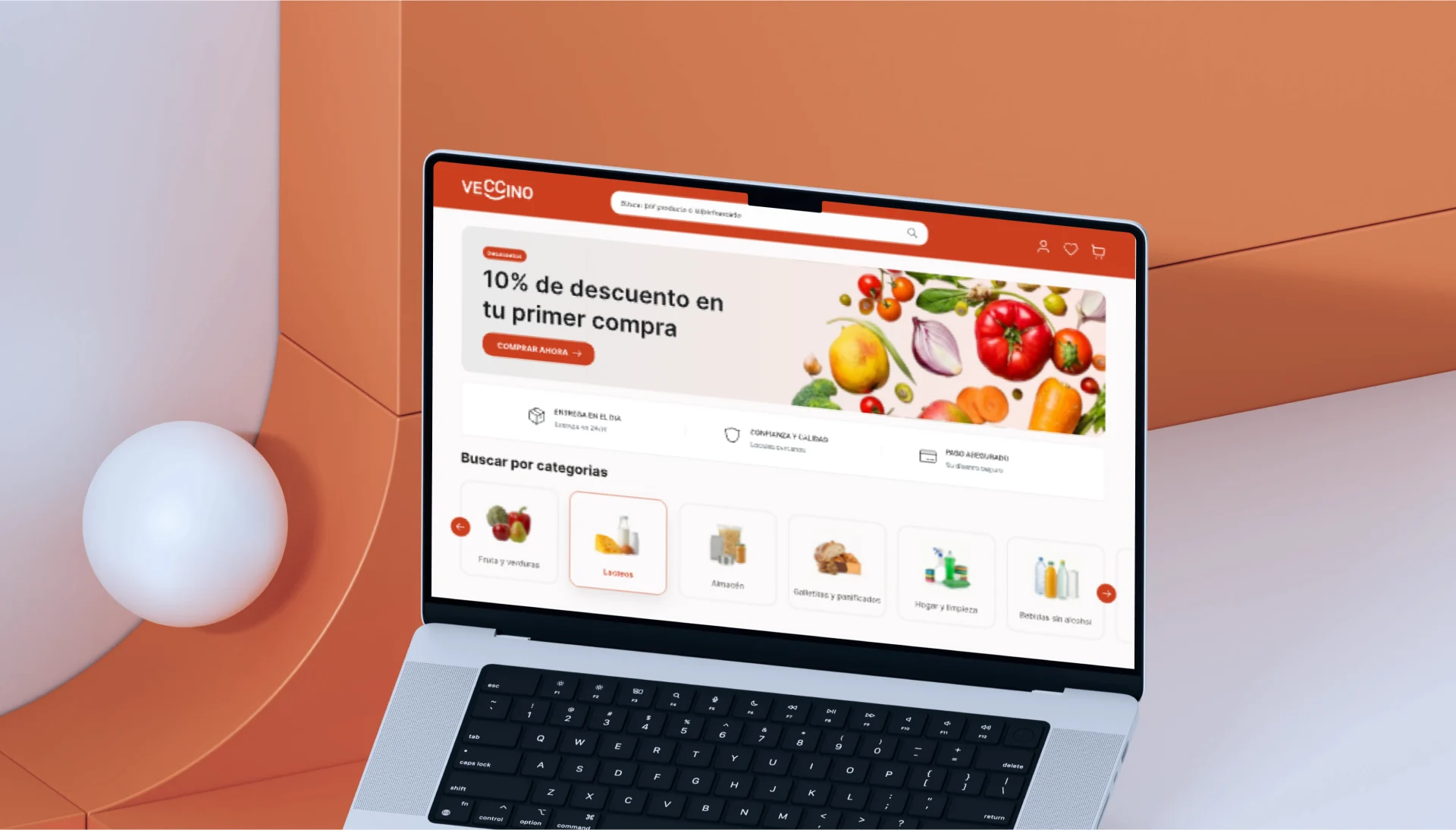
Veccino is a marketplace and delivery platform designed to connect Chinese supermarkets with consumers through a simple, accessible digital shopping experience.
The project was framed as an MVP, aiming to build a first functional version that would validate the proposal, run through the full purchase and delivery flow and identify opportunities for improvement before moving toward a scalable solution.
The project arises from the need to digitize a market segment that, in many cases, still operates without technological infrastructure or its own online sales and home delivery channels. This limits its reach and competitiveness against large chains and e-commerce platforms.
The goal of the MVP was to build a first functional version of the system that would validate the proposal, test the full purchase and delivery flow and identify opportunities for improvement before moving toward a scalable solution.
Besides improving the shopping experience, the goal was to create new growth opportunities for stores, expanding their reach and connecting them with more consumers.
My role combined UX/UI design and project management. I gathered the business requirements with the client, translated that brief into product decisions, defined the architecture of the three experiences, built the design system from Veccino's brand manual, and kept communication with the client going throughout the process.
Consumer profile
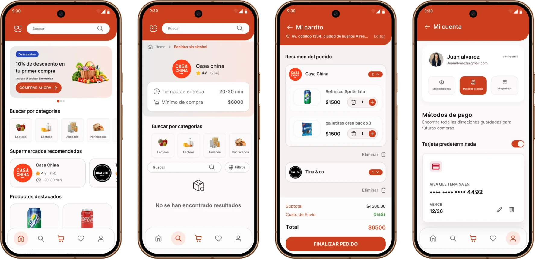
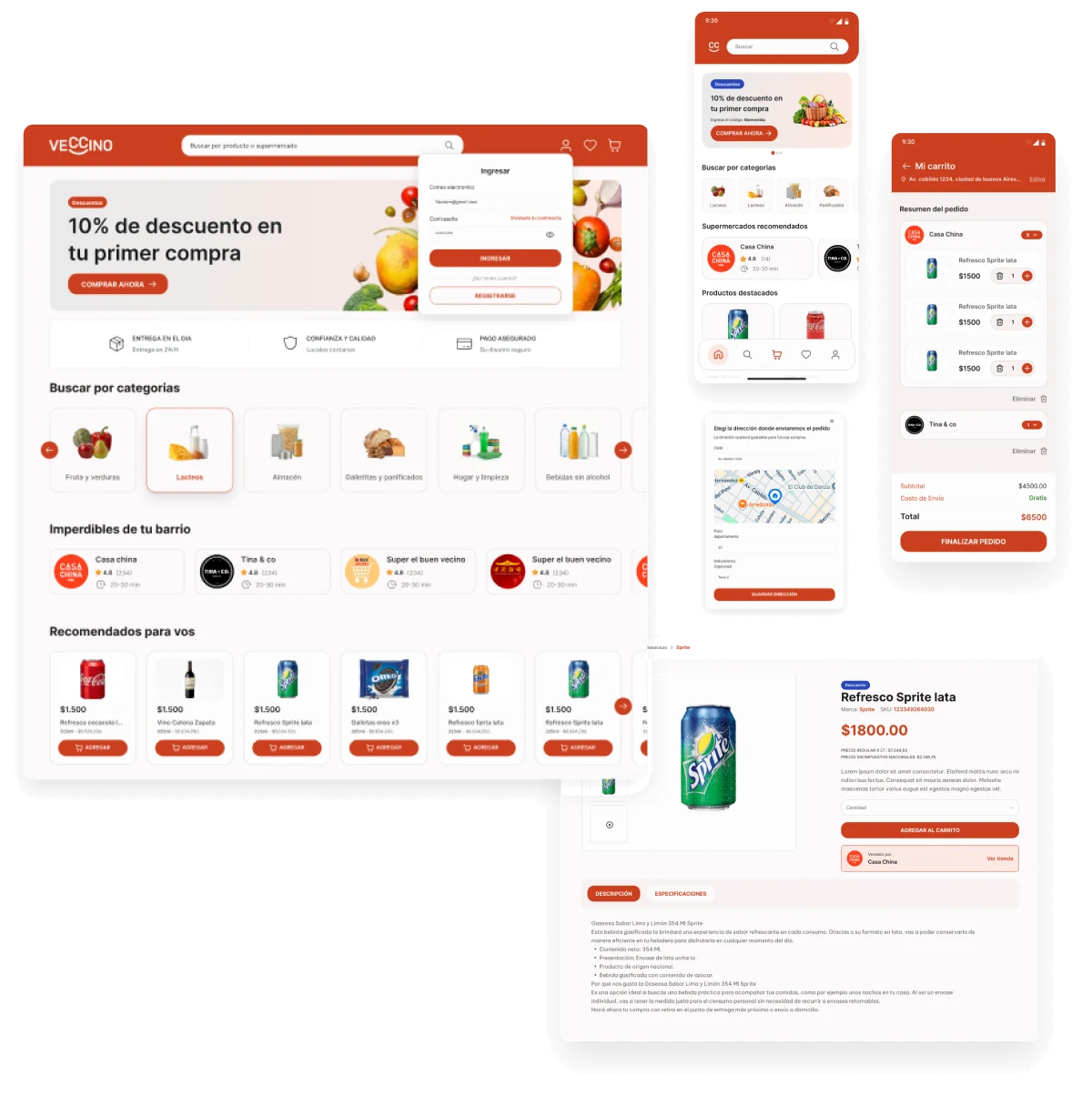
Veccino's public face — designed so that buying from your usual supermarket is as simple as ordering from a big app.
- Self-service sign-up with email verification before buying
- Browsing by search, category, brand, proximity and price
- An independent cart for each store
Store profile
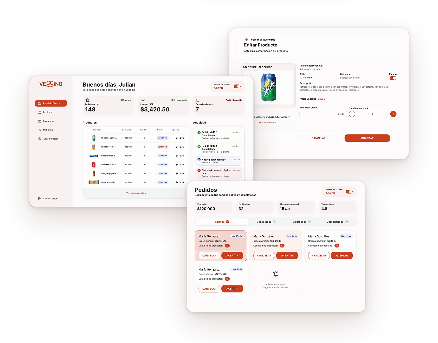
Sell online without having to solve the technology yourself
The operational tool that lets each supermarket join the platform and manage its day-to-day with no technical friction.
- Own catalog: choose products from the global catalog and set their price and stock
- Order management: confirm or reject, and move the status forward until delivery
- Store profile with a manual Open / Closed status
- Opening hours with multiple time slots per day
Administrator profile
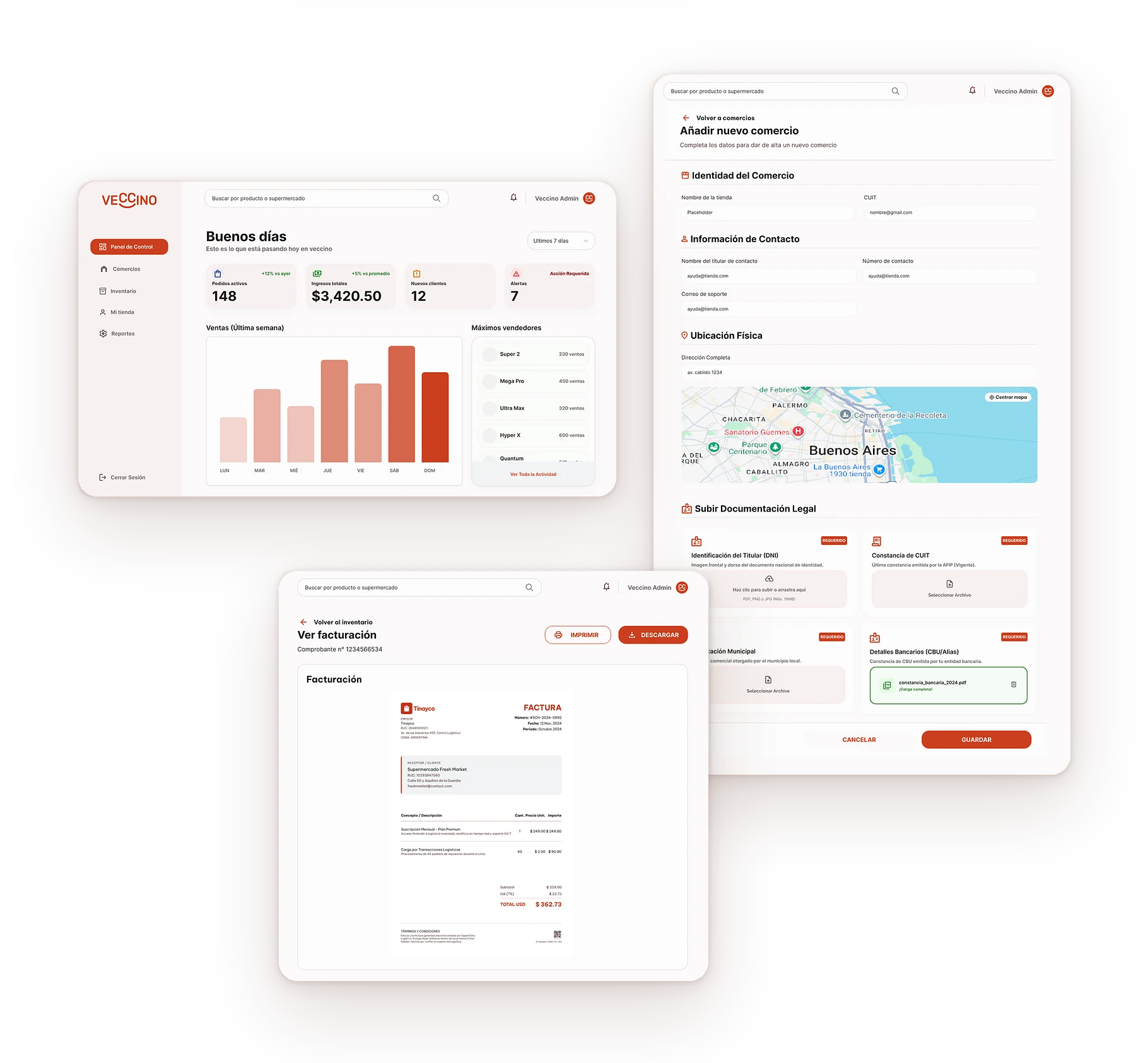
The internal panel to onboard stores, maintain the global catalog and see the performance of the whole network.
- Store onboarding: creates the store and the merchant user in a single transaction
- User and role management: admin, store and consumer
- Global product catalog — the source of truth stores rely on
- Read-only view of stock and orders across the whole network
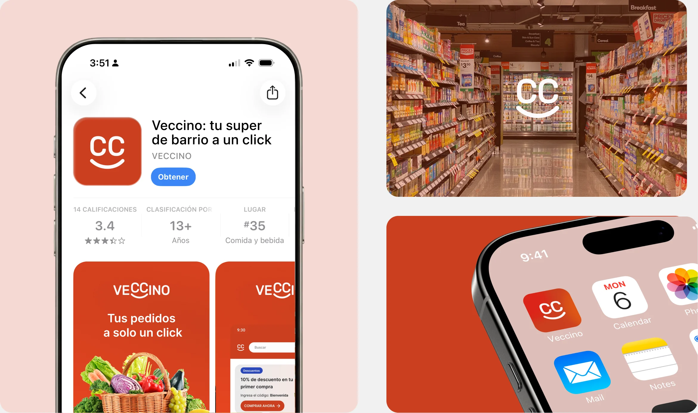
Veccino comes from combining “Vecino (neighbor) + Chino (Chinese)”, a simple name that is easy to pronounce and sounds friendly.
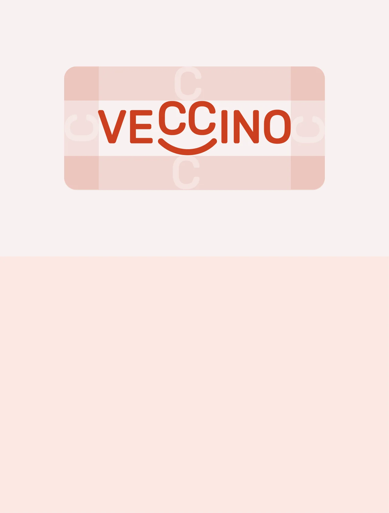
The smile built into the logotype reinforces this wordplay and adds a welcoming gesture.
From this idea, we set out to build a close, friendly and trustworthy identity that blends naturally into everyday life.
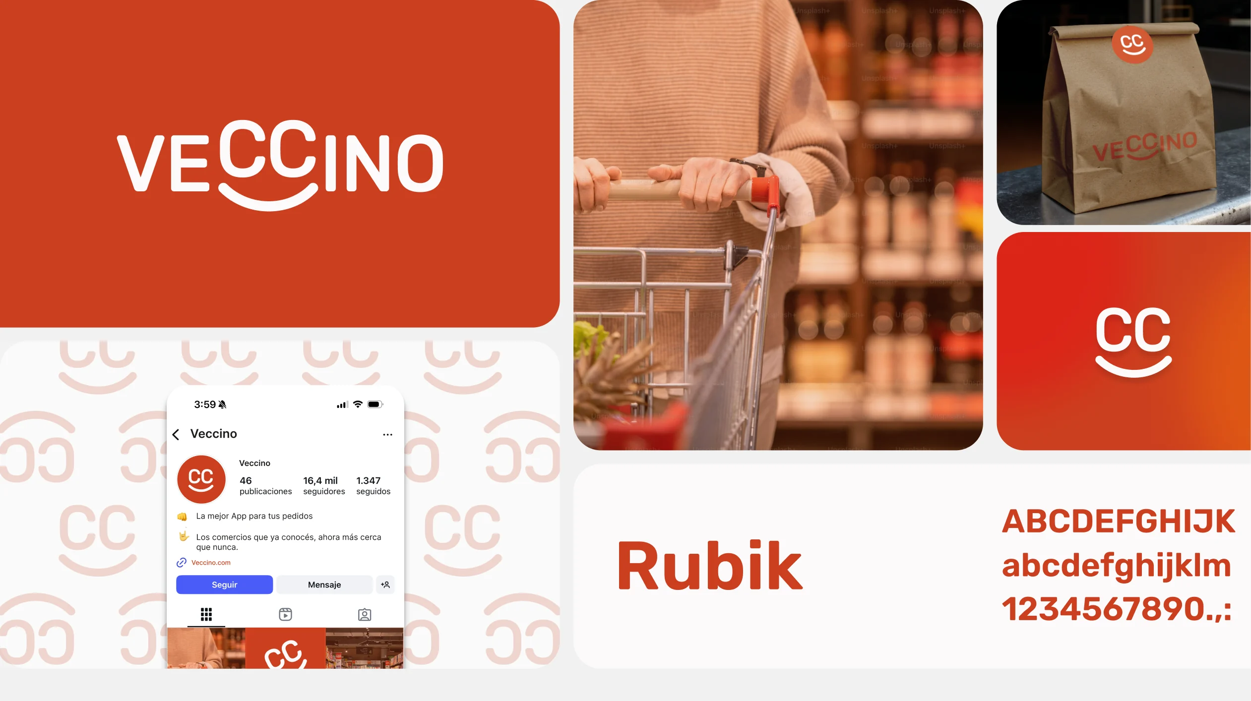
Orange brings energy, warmth and closeness, and becomes the lead color of the identity.
Combining its different shades with neutrals creates a dynamic, friendly and professional brand.
The smile aims to represent a positive shopping experience: a place that is close, accessible and trustworthy. This way, the gesture works not only as a graphic device but as part of the brand concept.
HEX: #80240D
HEX: #CC3F1F
HEX: #FCE8E3
HEX: #F7F1F0
HEX: #F4F4F4
HEX: #FCFAFA
A design foundation ready to scale
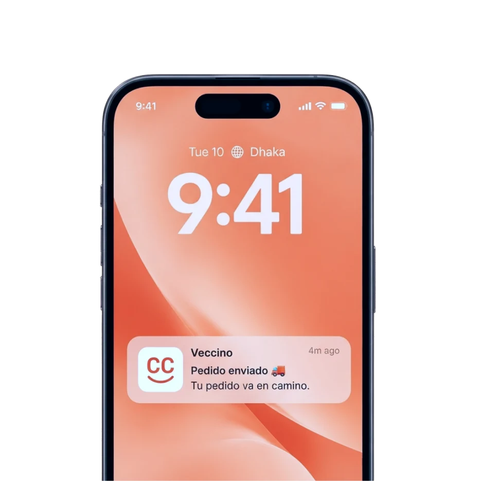
The design work left a clear product architecture for the three experiences, a reusable component system, and a brand identity translated into a real interface — the foundation on which Veccino can keep building as the project moves toward launch.